
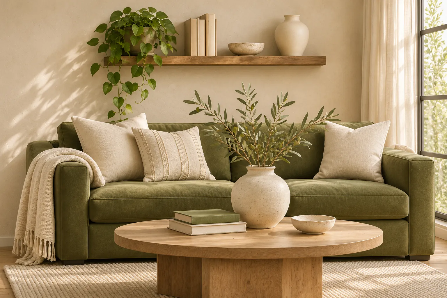
HOME & LIVING · COLOR STORIES
Decorating with Green in 2027
A Room-by-Room Guide to Sage, Olive & Earthy Greens
An olive sofa, soft sage walls, or a green patterned curtain can change the character of a room. The useful question is which shade will work with the furniture, finishes, and light you already have.
Green home decor trends for 2027 offer several starting points. Dulux’s Soulful Sage is light and silvery; BEHR’s Grounded is a deeper, brown-leaning olive; Sherwin-Williams’ Celery is a lighter herbal green with yellow undertones. Each is a separate brand’s Color of the Year. www.dulux.co.uk
Our interpretation brings muted sage and earthy olive together with ivory, oak, and walnut. The rooms below show how to vary that palette, with options ranging from a textile update to painted cabinetry.
Choose your green around what you already have
Sage is usually a muted, gray-influenced green. Try it when you want gentle contrast with ivory, oatmeal, or pale wood. Olive generally has more yellow or brown in it, giving it an earthy character alongside cream, walnut, and warm stone. Both families include lighter and darker shades, so compare the actual color rather than relying on its name.
Start beside your largest existing surface. With a golden oak floor, check whether an olive becomes too yellow. Beside cool gray tiles, compare a gray-green sage with a warmer olive to see which relationship you prefer.
Place large samples upright and view them in daylight and under your usual lamps. With fabrics, compare swatches against the sofa or curtains they will sit beside.
Soft sage
Earthy olive
Warm ivory
Natural oak
Deep brown
Living room: let olive be the focal point
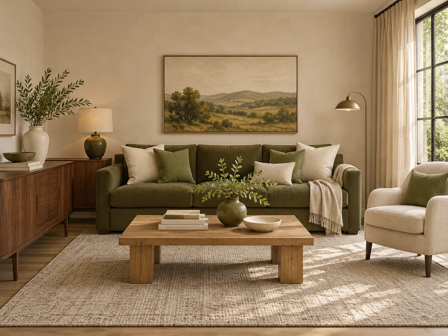
In our living room illustration, the olive sofa is the largest block of color. Ivory walls and a cream armchair give it contrast, while the landscape artwork repeats green higher up in the room. That repetition connects the sofa to its surroundings.
The oak coffee table and walnut cabinet add different wood tones. They sit within the same warm palette, while their lighter and darker surfaces keep the arrangement from looking flat.
For a smaller update, keep your existing neutral sofa and borrow the color relationship: an olive cushion, a lighter sage cushion, and artwork containing a related green. Repeat an existing cream or brown among the new pieces.
The pairing: earthy olive + warm ivory + walnut.
Kitchen and dining: follow the stone and wood
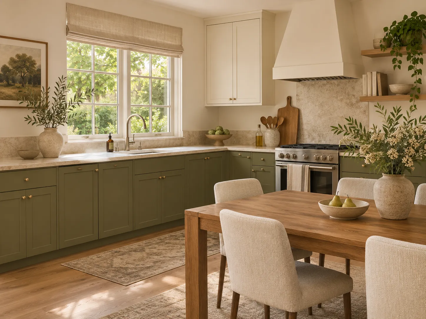
The illustrated kitchen uses olive on the lower cabinets, with pale stone and ivory above. Keeping the upper half lighter provides contrast and makes the cabinetry the main green feature.
Use your countertop as the starting point. Hold samples against both the stone and the backsplash, then compare them with the floor. If those surfaces are already dark, test a lighter green alongside your deeper choices before deciding.
The oak dining table carries the warm wood palette into the eating area. To try a similar connection without repainting, use green napkins or a ceramic serving bowl and keep a neutral from the kitchen in the table setting.
The pairing: muted green + warm stone + oak.
Bedroom: layer olive with warm ivory
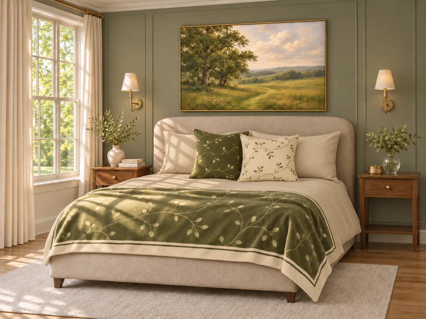
Keep the largest bedding surfaces in warm ivory, then introduce olive through pillows, a decorative blanket, and artwork. In this room, the landscape above the bed sets the palette, while walnut bedside tables echo its earthy brown tones.
The light and dark botanical pillows share a leafy pattern, creating contrast while keeping the arrangement connected. The blanket repeats those colors at a larger scale, and its ivory border gives the patterned area a clear edge against the plain bedding.
To try this approach with your existing bedding, choose one patterned pillow and a coordinating throw first. Leave some plain fabric visible around them so each design has room to stand out.
The pairing: earthy olive + warm ivory + walnut.
Explore our Olive Countryside collection for landscape artwork and botanical accents in coordinating olive, sage, and warm ivory tones.
Bathroom: give one pattern the lead
A shower curtain occupies enough space to establish the bathroom’s main pattern. In both illustrated schemes, plain pale flooring and mostly ivory towels give the curtain room to stand out.
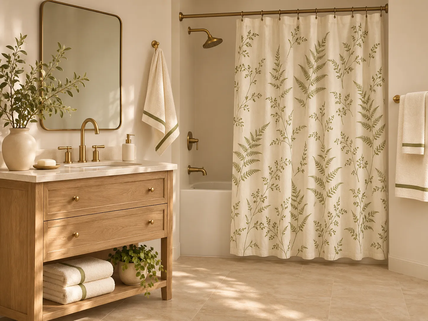
Botanical: softer shapes
The botanical curtain brings curved leaves and stems into a room defined by straight tile lines and cabinetry. The narrow green towel borders repeat its color at a smaller scale, creating a connection without adding another large print.
If your existing tiles are already patterned, look for a more open botanical design with plenty of plain background, and compare the two patterns together.
The pairing: sage or olive + ivory + natural oak.
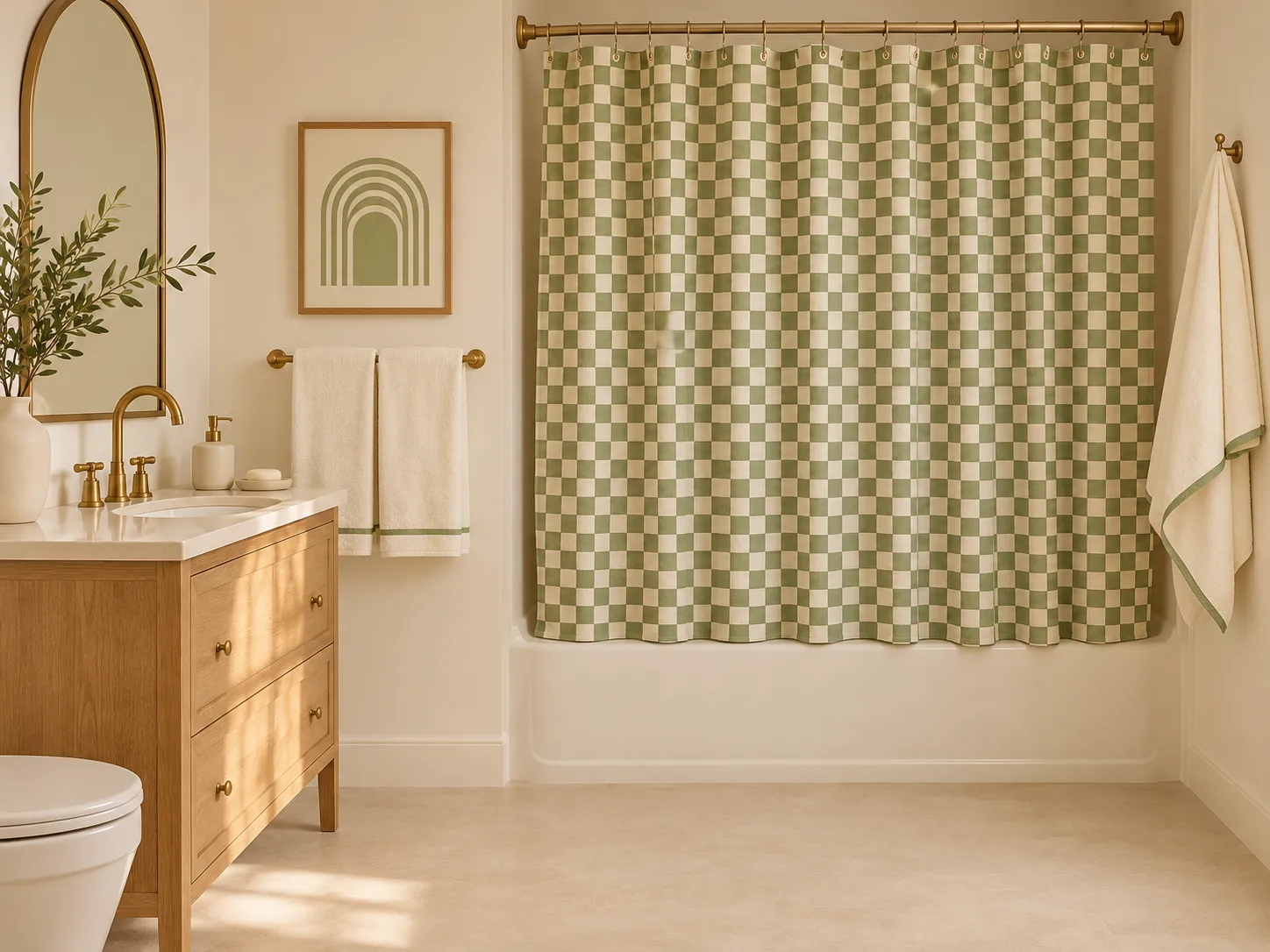
Checked: a little more structure
The checked curtain provides a regular rhythm, while the curved wall art introduces a different shape. Their shared green-and-cream palette helps them sit together.
When choosing checks, look at the whole curtain rather than only a close-up. Small checks create a finer, busier pattern; larger checks make more distinct blocks. Consider how either will look beside grout lines and any existing patterned surfaces.
Connect the rooms with a few repeated details
Choose two or three elements to carry through the home: perhaps warm ivory, an oak finish, and a muted green. Let their proportions change.
The living room might feature a large olive sofa, the bedroom a softer sage backdrop, and the bathroom just a patterned textile. Those different amounts of color allow each room its own character.
Where spaces are visible together, compare their samples in the same view. Start with one room, establish a combination you enjoy, and use that as a reference for the next choice.
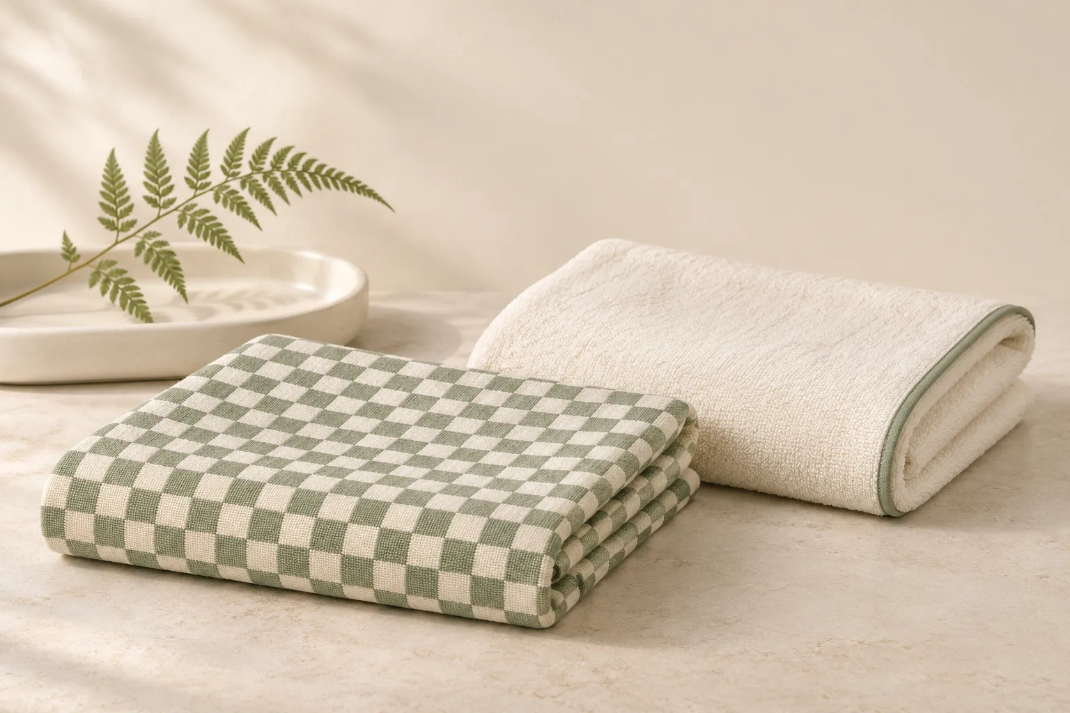
Find your green bathroom style
Explore Olive Botanical Spa for leafy patterns or Sage & Cream Check for a geometric direction. Start with the piece that will lead your room, then choose a few supporting details.
SAVE THIS INSPIRATION
PIN THESE IDEAS FOR LATER
Keep these sage and olive decorating ideas handy for your next home refresh.
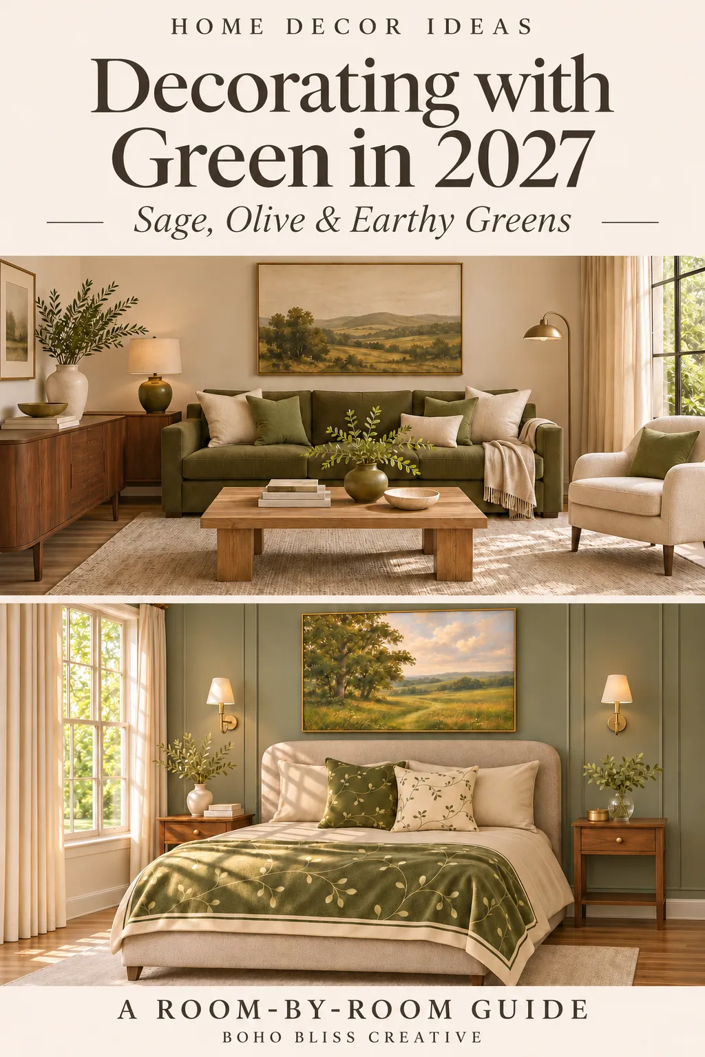
Interior images are AI-generated styling illustrations, not exact representations of branded paint colors or collection products. Check individual product listings and physical samples when making your choices.
Sources and further reading
You may also love
How to Create a Warm and Cohesive Christmas Home
HOME & LIVING · CHRISTMAS How to Create a Warm and Cohesive Christmas Home Simple ways to bring your holiday colors, textures and favorite pieces together. A cohesive Christmas home begins with a few details that work together: colors borrowed from...

What to Write in a Christmas Card | 24 Message Ideas
THE CHRISTMAS EDIT What to Write in a Christmas Card 24 thoughtful messages to make your own A Christmas card can be a lovely excuse to say something that gets lost in everyday messages. Thank you for being there. We miss you. That afternoon together...

Christmas Card Styles: Find Your Holiday Favorite
THE CHRISTMAS EDIT 2026 Find Your Christmas Card Style 12 designs for a meaningful holiday greetingA little nostalgia. A favorite photograph. A few words that feel like you. Discover a Christmas card that captures your kind of holiday.01 A Christmas Full of...